7 Landing Page Best Practices to Boost Conversions in 2025
Stop Wasting Clicks: The Power of Focus
Every click you pay for should drive action—yet generic pages scatter attention and kill conversions. In this listicle, you’ll learn landing page best practices that turn traffic into leads and sales. We’ll show you how to sharpen your value proposition, hone a single conversion goal, build a clear visual hierarchy, and adopt mobile-first responsive design. You’ll also discover how to boost credibility with social proof, streamline forms for higher completion rates and use A/B testing for continuous optimization. Mastering these focused techniques ensures your landing page becomes a conversion machine, maximizes ROI, delivers measurable growth for your campaigns and unlocks more value from every click.
1. Focused Value Proposition
A focused value proposition is the beating heart of any high-converting landing page. It’s a concise, compelling statement—usually in your headline and subheadline—that answers your visitor’s primary question: “What’s in it for me?” By immediately showcasing the unique benefit your product or service delivers, you set clear expectations, reduce bounce rates, and guide prospects toward your call to action. Embedding a strong value proposition is one of the most essential landing page best practices you can adopt to turn clicks into conversions.

How It Works and Why It Matters
When visitors arrive, they scan your headline in less than two seconds. A sharply worded value proposition captures attention, conveys relevance, and persuades them to stay. It aligns with the ad or link they clicked (message match), builds instant credibility, and primes them for your offer. Without it, your landing page risks confusion, high bounce rates, and lost conversions.
Key Features
- Prominent Headline: Clearly states the main benefit in fewer than 10 words when possible.
- Supporting Subheadline: Adds context, addresses common objections, or highlights a secondary benefit.
- Customer-Centric Language: Speaks directly to the visitor’s needs (“you,” “your”) rather than focusing on company features.
- Problem-Solution Focus: Demonstrates how you solve a specific pain point or fulfill a precise need.
Pros and Cons
Pros:
- Immediately communicates relevance to visitors
- Reduces bounce rates by establishing value upfront
- Sets proper expectations for the rest of the page
- Improves conversion rates by tapping into visitor motivations
Cons:
- Distilling complex offerings into a brief statement can be challenging
- Requires continuous testing and refinement to find the optimal wording
- Different audience segments may respond better to alternative value propositions
Real-World Examples
- Slack: “Where work happens.” A simple, memorable promise that defines the platform’s purpose.
- Shopify: “Anyone, anywhere can start a business.” Empowers users by emphasizing inclusivity and ease of use.
- Unbounce: “Build, publish and A/B test landing pages without IT.” Directly addresses marketers’ pain points with a clear solution.
Actionable Tips for SMEs and Startups
- Conduct voice-of-customer research—interview prospects or survey users to capture the exact language they use when describing your solution.
- Focus on benefits over features: highlight the end result (“double your leads”) instead of technical specifications.
- Keep it concise: aim for a headline under 10 words and a subheadline under 20.
- A/B test different headlines and subheadlines to identify the highest-performing message for each audience segment.
When and Why to Use This Approach
Always lead with your value proposition—place it “above the fold” so it’s visible without scrolling. Use a focused value proposition when:
- Running paid campaigns (PPC, social ads, email blasts) that demand message match.
- You need to differentiate in crowded markets.
- You want to guide visitors toward a single, specific action with minimal distractions.
By incorporating a focused value proposition into your landing page—a cornerstone of landing page best practices—you’ll give visitors a reason to stay, engage, and convert.
2. Single Conversion Goal
A Single Conversion Goal landing page zeroes in on one clear action—whether it’s signing up for a newsletter, downloading a guide, or completing a purchase. By stripping away distractions (like navigation menus or multiple links) and aligning every element around that one objective, you guide visitors straight to your primary call-to-action (CTA). This “one page, one purpose” approach reduces cognitive load and decision fatigue, making it a cornerstone of landing page best practices.
The Single Conversion Goal framework works by creating a visual and content hierarchy that funnels attention from headline to CTA. At the top sits your bold headline and hero image; below, benefit-driven copy and trust signals build momentum; finally, a prominent button invites the user to convert. Every section exists solely to reinforce that one button click.
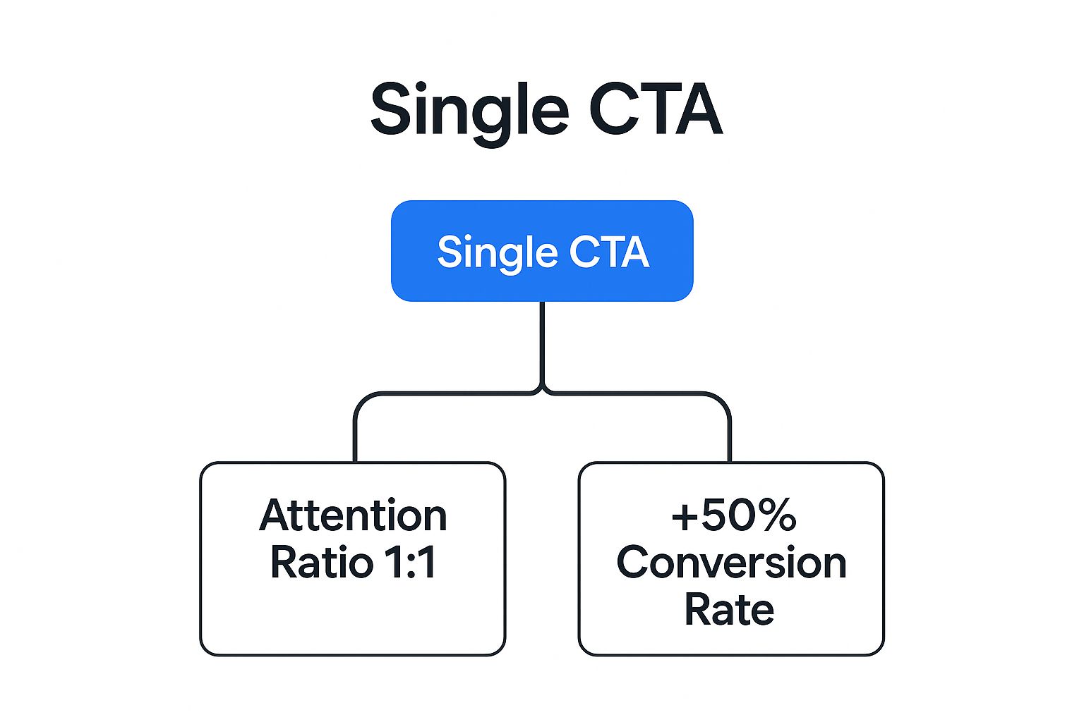
The following hierarchy diagram visualizes the structure and priority of page elements in a Single Conversion Goal design:
This hierarchy diagram highlights how:
- Level 1: Primary CTA and hero headline command immediate attention
- Level 2: Benefit statements and social proof back up your claim
- Level 3: Supporting visuals and secondary details maintain engagement
- Level 4: Repeated CTAs throughout the scroll keep the focus on conversion
Features & Benefits
- One primary call-to-action that stands out visually
- Removal of navigation menus and external links
- All copy, imagery, and design aligned to support the main conversion goal
- Strategic repetition of the CTA at key scroll points
Benefits include higher click-through and form-completion rates, a streamlined testing process, and a crystal-clear user journey—from entry to action.
When & Why to Use This Approach
Use a Single Conversion Goal landing page when you need:
- Maximum focus on a single offer (webinar sign-up, ebook download, lead form)
- Clean, distraction-free environments to boost conversion rates
- Simplified A/B testing—only one variable (your CTA) changes
Avoid this method if your product legitimately requires multiple next steps (e.g., complex SaaS demos plus training sign-up) or if your audience craves deep exploration before converting.
Real-World Examples
- Airbnb’s search page features a lone search bar, encouraging immediate destination queries.
- HubSpot’s ebook landing pages strip away navigation, funneling visitors directly into their lead-capture forms.
- Dropbox’s minimalist sign-up page removes all distractions, driving users to create accounts instantly.
Actionable Tips
- Remove all navigation elements—including header menus and footer links.
- Place your primary CTA above the fold, and repeat it after key benefit sections.
- Use a high-contrast color for your button to make it pop against the background.
- If you must include a secondary CTA (e.g., “Learn More”), style it smaller or in muted tones.
- Script your copy as a logical narrative that leads to the CTA: problem → solution → benefits → action.
Pros & Cons
Pros
- Increases conversion rates by eliminating distractions
- Simplifies tracking and optimization
- Creates a clearer, more predictable user journey
- Enhances the effectiveness of A/B tests
Cons
- May frustrate visitors who seek more information
- Limits exploration for users with different needs
- Not suited for complex products requiring multiple conversion paths
Why This Deserves Its Place in Your Strategy
Focusing on a single conversion goal is one of the most potent landing page best practices because it aligns your visitor’s attention and your marketing metrics toward one outcome. As Oli Gardner of Unbounce’s “attention ratio” concept and Tim Ash’s work in Landing Page Optimization show, a 1:1 ratio of entrance to CTA options maximizes user action—and ultimately, your ROI.
At Well Web Marketing, we design and optimize landing pages around this principle to deliver lean, high-impact conversion machines. Ready to turn more clicks into customers? Contact us to build your next Single Conversion Goal page and skyrocket your results.
3. Compelling Visual Hierarchy
A compelling visual hierarchy arranges and presents elements on your landing page to guide visitors’ attention in a deliberate, strategic sequence. By manipulating size, color, contrast, spacing, and positioning, you create a clear visual pathway—from your headline and value proposition straight to your call-to-action—boosting clarity and conversion. As one of the core landing page best practices, an effective hierarchy ensures that users immediately spot what matters most, even when they’re merely skimming.
What Is Visual Hierarchy and How It Works?
Visual hierarchy leverages human scanning patterns (like the F-pattern or Z-pattern) to present content in a way that feels natural. Larger headlines draw the eye first, bold colors highlight CTAs, and generous white space around key elements reduces clutter. By grouping related content together and repeating consistent design cues, you minimize cognitive load and keep visitors focused on your conversion goal.
When and Why to Use This Approach
Use compelling visual hierarchy any time you need users to:
• Notice your value proposition instantly
• Understand benefits at a glance
• Act—click a button, fill a form—without distraction
Whether you’re an SME launching a new product, a startup founder refining your pitch page, or an e-commerce team optimizing a flash-sale funnel, visual hierarchy converts by making the path to action as obvious as possible.
Key Features and Benefits
• Strategic use of size, color, and white space emphasizes priority elements.
• Z-pattern or F-pattern layouts match natural eye movement.
• Proper content grouping creates logical visual flow.
• Consistent design elements (fonts, colors, icons) build order and reduce friction.
Pros and Cons
Pros:
- Guides visitors’ attention directly to your CTA
- Improves comprehension, even for fast scanners
- Enhances overall user experience and skimmability
Cons:
- Requires design expertise and possibly multiple iterations
- Cultural differences in visual cues can alter effectiveness
Real-World Examples
• Stripe’s homepage uses oversized headlines and strategic whitespace to highlight their value proposition before inviting users to “Start now.”
• Basecamp’s landing pages deploy high-contrast buttons and well-spaced sections so CTAs instantly pop.
• Mailchimp applies a clear typography hierarchy and generous margins to guide visitors through features to sign-up.
Actionable Tips for Your Landing Page
- Place your headline and main benefit “above the fold” where they’re seen first.
- Use contrasting button colors to make CTAs stand out against the background.
- Create a visual path: lead users from problem → solution → action in a single glance.
- Add directional cues—arrows, images of people looking toward your form or button.
- Run five-second tests: show users your page for five seconds and ask what they recall first.
Why This Deserves a Spot in Landing Page Best Practices
No matter how persuasive your copy or compelling your offer, a cluttered or poorly organized page will dilute your message. Compelling visual hierarchy is the backbone of any high-converting landing page—it orchestrates attention, reduces confusion, and drives users straight to your conversion goal. By mastering this practice, you ensure every visitor’s eye is drawn exactly where you want it, turning clicks into customers.
4. Mobile-First Responsive Design
In today’s world—where over half of all web traffic comes from smartphones and tablets—mobile-first responsive design is no longer optional; it’s an essential part of any landing page best practices playbook. Rather than designing for desktop and then “adapting” to smaller screens, a mobile-first approach starts with the constraints and opportunities of phones, then scales up to tablets and desktops. This ensures your landing page not only looks great but also performs smoothly, regardless of device.
What It Is & How It Works
- Fluid Grid Layouts
Content is placed in proportional, percentage-based columns that reflow naturally as the viewport changes. - Touch-Friendly Elements
Buttons, links, and form fields are designed with a minimum tappable area (ideally 44×44 pixels) and generous spacing. - Optimized Load Times
Images are compressed, scripts are deferred, and unnecessary assets are eliminated to speed up mobile connections. - Simplified Navigation
Hamburger menus, accordions, or collapsible sections keep menus out of the way until needed. - No Horizontal Scrolling
Content wraps and stacks vertically, ensuring readability without side-to-side swipes.
By focusing first on the most restrictive screen size, you force prioritization of messaging and reduce “bloat.” Once the mobile template is rock-solid, you expand and enrich the layout for tablets and desktops.
Why Use a Mobile-First Approach?
- Google’s mobile-first indexing means search ranking depends primarily on your mobile version.
- A consistent experience across devices builds trust and reduces friction.
- You future-proof your landing pages as global mobile usage continues to climb.
- Prioritizing mobile users can boost your key metrics—bounce rate, time on page, and ultimately, conversions.
Real-World Examples
- Airbnb: Their booking flow and hero imagery adapt seamlessly whether you’re on a tiny phone or a 27″ monitor.
- Uber: The core value proposition (“Get there. Your day belongs to you.”) and CTA (“Sign up to ride”) remain prominent and tappable on any device.
- Notion: A minimalist layout that scales content blocks and navigation elegantly, ensuring onboarding forms and feature highlights never feel cramped.
Actionable Tips for SMEs & Startups
- Test on Real Devices
Emulators are helpful—but nothing beats tapping and scrolling on a physical phone. - Use 44×44-Pixel Touch Targets
Make buttons, links, and form inputs easy to hit, even with a thumb. - Implement Progressive Disclosure
Hide secondary content behind “Read more” toggles to keep initial views clean. - Optimize Images & Minimize Requests
Leverage modern formats (WebP/AVIF), lazy-load below-the-fold assets, and combine CSS/JS files. - Consider AMP for Ultra-Fast Loading
Accelerated Mobile Pages can deliver near-instant load times on low-bandwidth connections.
Pros & Cons
Pros:
- Captures the majority of mobile-first users
- Improves SEO via Google’s mobile-first indexing
- Delivers a unified experience across devices
- Future-proofs your landing pages as mobile usage grows
Cons:
- Can require additional design and development resources
- Complex desktop interactions may need mobile-friendly simplification
- Some layouts or features may be compromised to maintain performance
When & Why to Apply It
If your campaign traffic is trending 50%+ mobile—or if you want to stay ahead of the curve—mobile-first responsive design should be the backbone of your landing page strategy. It’s particularly critical for paid social ads, SMS campaigns, and email sends, where clicks almost always originate on a phone.
At Well Web Marketing, we’ve mastered mobile-first responsive landing page design as one of our core landing page best practices. Whether you need a lean, high-velocity lead-gen page or a complex, multi-step signup flow, our team ensures your visitors get a fast, friction-free experience every time—on any device.
5. Social Proof and Trust Signals
Social proof and trust signals leverage the psychological principle that people tend to follow the actions of others and trust recognized authorities. On landing pages, these elements reassure visitors that your offering is credible, reliable, and valued by others—crucial for reducing skepticism and boosting conversions as part of landing page best practices.

By prominently showcasing customer testimonials, recognizable client logos, review counts and ratings, case studies, industry certifications, security badges, and media endorsements, you lower perceived risk and guide prospects toward your single, focused CTA. This method is particularly effective for high-involvement purchases—think software subscriptions, professional services, or high-value products—where trust is the currency that closes the deal.
Examples of Successful Implementation
• Salesforce: Displays logos of major brands (“Used by 150,000+ companies worldwide”) to signal enterprise-grade reliability.
• Zoom: Combines a precise count (“300 million daily meeting participants”) with third-party review ratings.
• Slack: Publishes detailed case studies (“How Trivago saved 30% on support tickets with Slack”) featuring real clients and measurable results.
When and Why to Use Social Proof & Trust Signals
- At points of friction: Place testimonials or security badges just above or beside your CTA button to quell last-second doubts.
- For high-cost offers: Reinforce value with case studies showing ROI or time-savings.
- When targeting new audiences: Leverage logos and endorsements from well-known companies to extend credibility by association.
Key Features & Benefits
• Customer testimonials with real names, photos, and specific results → Builds emotional resonance and addresses objections.
• Client/partner logos from recognizable brands → Instant credibility through association.
• Review counts & ratings from third-party platforms → Objective validation of quality.
• Case studies with measurable results → Hard data to support claims and justify investment.
• Industry certifications, awards, security badges → Reinforces safety and professionalism.
• Media mentions & endorsements → Extends third-party authority to your brand.
Pros
• Builds credibility and reduces perceived risk.
• Addresses common objections through others’ experiences.
• Leverages powerful psychological principles of social influence.
• Especially effective for high-involvement or high-cost purchases.
Cons
• Generic or clearly fake testimonials can damage credibility.
• Too many trust elements can clutter the page and distract from the CTA.
• Requires ongoing collection and curation of social proof.
Actionable Tips
- Use specific, results-oriented testimonials (“I doubled leads in 3 months with Well Web Marketing”) instead of vague praise.
- Feature testimonials from customers who match your target audience’s profile.
- Place social proof strategically near points of friction—just before the form or CTA.
- Rotate testimonials periodically to show variety and maintain freshness.
- Always secure permission before using customer quotes or logos.
- Consider short video testimonials for higher impact and authenticity.
Why It Deserves Its Place in Landing Page Best Practices
Trust is the bedrock of any conversion. Even the most compelling headline and slick design can fall flat if visitors don’t believe you can deliver. Social proof and trust signals are non-intrusive, yet powerful, tools that validate your offer and nudge prospects toward action. Integrating them thoughtfully is a core landing page best practice for driving higher conversion rates.
Ready to harness the power of social proof on your next campaign? At Well Web Marketing, we specialize in weaving authentic trust signals into every landing page we craft.
6. Optimized Form Design
Forms are often the final barrier between a visitor and your conversion goal—whether it’s capturing a lead, scheduling a demo, or completing an order. Optimized Form Design minimizes friction in this critical step by making forms as simple and painless as possible to complete. By following landing page best practices, you streamline the user journey, reduce abandonment, and boost overall conversion rates.
What Is Optimized Form Design and How It Works
Optimized Form Design focuses on four pillars:
- Minimal Fields
Only ask for information that’s absolutely necessary. Every additional field increases friction and risk of abandonment. - Logical Progression & Grouping
Organize inputs in a single-column layout and group related fields. For longer forms, use progressive disclosure or multi-step approaches to avoid overwhelming users. - Clear Guidance & Validation
Provide visible labels, helpful placeholder text, and inline validation so users receive immediate feedback—no guessing which field is wrong. - Device-Friendly Interaction
Employ mobile-optimized input types (email, telephone, date pickers) and generous touch targets. Enable smart defaults and browser auto-fill where appropriate.
Together, these techniques remove unnecessary barriers and make the form feel more like a natural conversation than a chore.
Why Use Optimized Forms on Your Landing Pages
- Higher Completion Rates: Short, focused forms dramatically cut abandonment.
- Better Data Quality: Clear prompts and validation ensure the information you collect is accurate.
- Improved User Experience: Users appreciate speed and clarity—especially on mobile.
- Accessibility Gains: Simplified layouts, labels, and error messages make forms usable for everyone.
Use Optimized Form Design whenever your landing page’s goal involves data capture—newsletter sign-ups, trial requests, quote forms, registrations, or e-commerce checkouts.
Real-World Examples
- Typeform: Their conversational, one-question-at-a-time interface feels personal and boasts high completion rates.
- Netflix: Onboarding asks only for email and password initially, postponing additional information until after account creation.
- Amazon One-Click: Eliminates form entry for returning customers by leveraging stored payment and address data.
Actionable Tips for Your Next Form
- Reduce fields to the absolute minimum—each input adds abandonment risk.
- Use a single-column layout for smoother eye movement and completion flow.
- Clearly mark optional fields or omit them entirely.
- For longer forms, implement multi-step “wizard” experiences with progress indicators.
- Enable inline validation so users can correct mistakes in real time.
- Test different form lengths and designs (A/B testing) to find the ideal balance between form complexity and conversion.
Pros and Cons
Pros:
- Significantly improves form completion rates
- Reduces user frustration and abandonment
- Increases the quality and accuracy of submitted data
- Enhances accessibility and mobile usability
Cons:
- Tension between marketing’s data-gathering goals and UX best practices
- You may collect less prospect information up front
- Complex offers sometimes require more extensive forms
How Well Web Marketing Can Help
At Well Web Marketing, we build every landing page around your conversion goal—and that includes meticulously optimized forms. Our team applies proven best practices from Luke Wroblewski’s “Web Form Design,” Formstack’s conversion research, and the Baymard Institute to craft forms that feel effortless. Whether you need a lean newsletter signup or a sophisticated multi-step application, our expertise in landing page best practices ensures your forms convert more visitors into valuable leads.
By integrating Optimized Form Design into your landing page strategy, you’ll remove unnecessary friction, respect your users’ time, and watch your conversion rates climb.
7. A/B Testing and Continuous Optimization
A/B testing—also known as split testing—is a cornerstone of landing page best practices. Rather than guessing which headline, hero image, or call-to-action (CTA) will resonate, you serve Version A to one group of visitors and Version B to another. By measuring real user behavior against your conversion goal, you can statistically validate which variation performs better—and then roll out the winner site-wide. Over time, this data-driven, continuous optimization approach compounds improvements, drives higher conversion rates and maximizes ROI.
How It Works
- Pick one element to test (e.g., headline, CTA color, form length).
- Create Variant A (current version) and Variant B (your change).
- Split incoming traffic evenly and run until you reach statistical significance (typically 1–4 weeks).
- Analyze key metrics: conversion rate, bounce rate, time on page, lead quality.
- Implement the winning version, then prioritize your next test.
Why It Matters in Landing Page Best Practices
- Removes Guesswork: Real user data tells you what works, not hunches.
- Compounding Gains: Each small lift builds on the last, yielding exponential growth.
- Cost-Effective Growth: Incremental changes often cost less than full redesigns but deliver measurable impact.
- Actionable Insights: You might discover unexpected visitor preferences—insights you can apply across campaigns.
Features & Benefits
• Systematic testing of headlines, images, CTAs, layouts
• Statistical validation to avoid false positives
• Prioritization framework based on impact vs. effort
• Multivariate testing for deeper understanding of element interactions
• Ongoing monitoring of conversion and lead-quality metrics
Pros and Cons
Pros
- Data-backed design decisions
- Continuous improvement cycle
- Quantifiable business impact
- Reveals hidden user insights
Cons
- Requires sufficient traffic for reliable results
- Can be resource-intensive to set up and monitor
- Risks settling for local maxima if you only test incremental tweaks
- Needs careful setup to prevent flawed data or false positives
Real-World Examples
- Booking.com runs hundreds of simultaneous tests on key landing pages, optimizing everything from promotion banners to search filters.
- HubSpot reports a 711% uplift in conversions after adopting a rigorous A/B testing regimen.
- Basecamp regularly experiments with pricing page variations to maximize sign-ups and subscriptions.
Actionable Tips for SMEs and Startups
- Start with High-Impact Elements: Headlines, hero images and primary CTAs move the needle fastest.
- One Change at a Time: Unless you have massive traffic, isolate variables to pinpoint what really works.
- Run Tests Long Enough: Aim for 1–4 weeks or until you hit statistical significance.
- Occasionally Go Big: Mix in radical variations—new layouts or offers—to avoid incremental plateaus.
- Document Everything: Record your hypothesis, test details and outcomes to build institutional knowledge.
- Segment Your Results: Compare performance by traffic source, device type or visitor persona for deeper insights.
When and Why to Use This Approach
Use A/B testing when you have a steady stream of visitors and a clear conversion goal—be it lead form submissions, e-book downloads or trial sign-ups. Continuous optimization transforms your landing pages into ever-sharper conversion machines, ensuring you squeeze maximum value from every click.
At Well Web Marketing, we embed A/B testing and data-driven optimization into every landing page engagement. Ready to harness the power of systematic testing and continuous improvement?
7 Best Practices Comparison Guide
| Best Practice | 🔄 Implementation Complexity | 💡 Resource Requirements | 📊 Expected Outcomes | ⚡ Ideal Use Cases | ⭐ Key Advantages |
|---|---|---|---|---|---|
| Focused Value Proposition | Medium – requires messaging skill and testing | Moderate – research and refinement needed | Clear visitor relevance, reduced bounce rates, improved conversions | Early-stage landing pages, new products | Quickly communicates unique benefits, sets expectations |
| Single Conversion Goal | Low to Medium – design and content alignment | Low – fewer elements to manage | Higher conversion rates, simplified user journey | Simple product sign-ups, lead captures | Eliminates distractions, improves A/B test clarity |
| Compelling Visual Hierarchy | Medium to High – needs design expertise | Moderate to High – skilled designers | Guides attention effectively, better comprehension and UX | Any landing page aiming to direct visitor flow | Enhances focus on CTAs, improves skimmability |
| Mobile-First Responsive Design | Medium to High – requires development resources | High – multiple device testing and development | Consistent experience across devices, better SEO | Mobile-heavy traffic sites, evolving markets | Future-proofs design, improves mobile usability |
| Social Proof and Trust Signals | Low to Medium – content curation and placement | Moderate – ongoing collection and updating | Builds credibility, reduces perceived risk, increases conversions | High-involvement products, trust-sensitive offers | Leverages social influence, reassures visitors |
| Optimized Form Design | Medium – UX design and testing needed | Moderate – collaboration between marketing and UX | Higher form completion, better data quality | Lead generation forms, e-commerce checkout | Minimizes friction, reduces abandonment |
| A/B Testing and Continuous Optimization | High – requires planning, tools, and analysis | High – continuous effort and traffic needed | Data-driven improvements, increased ROI and conversions | Mature sites with sufficient traffic | Removes guesswork, drives ongoing optimization |
Ready to Turn Clicks into Customers?
You’ve learned the core landing page best practices—from honing a focused value proposition and defining a single conversion goal to mastering compelling visual hierarchy, mobile-first responsive design, social proof, optimized forms, and relentless A/B testing. By applying these essentials, you’ll ensure every visitor experiences a clear, distraction-free path to action.
Key Takeaways:
- Prioritize a singular, benefit-driven message that aligns with your campaign.
- Build trust with testimonials, security badges, and concise forms.
- Optimize continuously by testing headlines, CTAs, and layouts for peak performance.
Next Steps for Maximum Impact:
- Audit your current landing pages against the seven best practices above.
- Implement one change at a time—such as refining your headline or removing extraneous links.
- Track results with analytics, run A/B tests, and iterate based on real user behavior.
Mastering these landing page best practices means more than incremental lifts in conversion rates—it translates into sustained digital growth, stronger brand credibility, and higher ROI for your campaigns. Whether you’re an SME aiming to scale, a startup founder seeking traction, or a corporate marketing team optimizing ad spend, these strategies will power your next leap forward.
Keep experimenting, stay customer-focused, and remember: every click brings you one step closer to a loyal customer.
Ready to supercharge your conversion rates? Let Well Web Marketing design and optimize landing pages that put these best practices into action—so you can turn more clicks into customers.