Making it Click: Essential User Interface (UI) Design Principles Explained
Beyond Pretty Buttons: UI Design Principles for Success
Want a website or app that’s both beautiful and easy to use? This listicle reveals the core UI design principles that drive positive user experiences and support your business objectives. Learn how consistency, visibility, user control, and other key concepts create intuitive interfaces that keep users engaged and coming back for more. These principles are fundamental to Well Web Marketing’s approach, ensuring client websites are both visually appealing and highly effective. Understanding these fundamentals can significantly impact user satisfaction and your bottom line.
1. Consistency
Consistency in UI design is paramount for creating a user-friendly and efficient digital experience. It refers to the practice of designing similar elements to look and function similarly, while ensuring distinct elements stand out. This principle significantly reduces the cognitive load on users, allowing them to intuitively navigate your website or application. They can transfer their knowledge and expectations learned from one part of the interface to another, streamlining their interaction. Consistency should be maintained across the board – in visual design (colors, typography, iconography), interaction patterns (how users perform actions), and terminology (the language used throughout the interface).
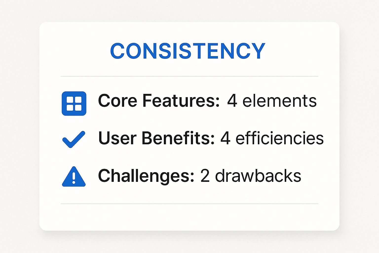
This infographic summarizes the key takeaways regarding consistency: predictable interactions, uniform terminology, consistent visuals, and resulting benefits like reduced learning curve and increased efficiency. As the infographic clearly shows, consistency breeds familiarity and predictability, reducing the mental effort required to use the interface. This directly translates to a smoother, more enjoyable user experience.
Consistency deserves a top spot in any list of essential UI design principles because it’s the bedrock of usability. Think of it like driving a car – the consistent placement of the steering wheel, pedals, and gear shift allows you to focus on the road, not on re-learning the controls every time you drive a different vehicle. A consistent UI offers the same advantage, enabling users to focus on accomplishing their goals rather than deciphering how the interface works. Specific features of a consistent interface include consistent visual elements (using the same color palette, fonts, and icon styles throughout), predictable interaction patterns (ensuring buttons and other interactive elements behave as expected), uniform terminology and language (using the same words and phrases for similar actions or concepts), and consistent layout and spacing across different screens or pages.
The benefits are numerous: reduced learning curve for new users, increased efficiency as users can predict how elements work, building trust through predictability, and significantly reduced cognitive load. Imagine landing on a website where the “Add to Cart” button is a different color and shape on every product page – confusing, right? Consistency eliminates that confusion and allows users to focus on the task at hand.
However, like any principle, adhering to consistency too rigidly can sometimes limit innovation and make it difficult to implement specialized functionality in certain areas. Maintaining absolute consistency across a large and complex application can also present challenges.
Examples of successful implementations of consistency include Apple’s Human Interface Guidelines, which enforce consistent UI elements across iOS applications; Google’s Material Design system, creating consistency across Android and Google products; and Microsoft’s Fluent Design System for a unified Windows experience. These design systems provide a framework for developers and designers to follow, ensuring consistency across a wide range of applications and platforms.
Here are some actionable tips for incorporating consistency into your UI design:
- Create and maintain a design system: A design system serves as a single source of truth for all UI elements and styles, ensuring everyone on your team is working with the same guidelines. This is especially helpful for larger projects and organizations.
- Establish clear design patterns for common interactions: Define how buttons, menus, forms, and other common elements should look and function. Document these patterns for easy reference.
- Perform regular UI audits: Periodically review your interface to identify and address inconsistencies that may have crept in over time.
- Use consistent terminology in labels and instructions: Ensure that the language used throughout your interface is clear, concise, and consistent.
By following these tips, you can leverage the power of consistency to create user-friendly, efficient, and enjoyable digital experiences that drive user satisfaction and support your business goals. At Well Web Marketing, we understand the critical importance of these principles and incorporate them into every web design project we undertake.
2. Visibility of System Status
One of the most crucial user interface design principles is visibility of system status. This principle emphasizes the importance of keeping users informed about what’s happening within the system through appropriate feedback within a reasonable time. Users should always have a clear understanding of their current location within the application, what operations are underway, and what they can expect to happen next. This transparency is achieved through clear status indicators, feedback on actions, and transparent system processes. A well-implemented visibility of system status fosters user confidence, reduces anxiety, and prevents unnecessary repeated actions.
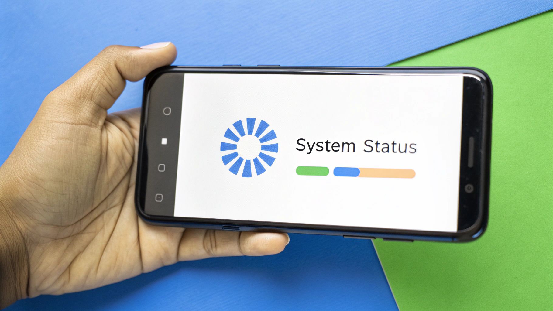
Think about the last time you submitted an online form. Did the website leave you wondering if anything happened after you hit the submit button? Or did it display a clear confirmation message or a loading animation? That’s visibility of system status in action. Features like loading indicators, progress bars, and confirmation messages are key components of this principle. These elements provide real-time feedback, assuring users that the system is working as expected and preventing them from impatiently clicking the submit button multiple times, potentially creating duplicate submissions.
Some common features used to achieve visibility of system status include:
- Loading indicators and progress bars: These visually represent the progress of ongoing operations, such as file uploads or complex calculations.
- Confirmation messages after actions: These acknowledge user input and confirm that actions have been successfully completed.
- Clear navigation indicators (breadcrumbs, highlighted menu items): These orient users within the application, showing them where they are in the site’s hierarchy.
- System status messages: These inform users about the overall state of the system, such as network connectivity or server status.
- Visual feedback for interactions: This can include changes in button color or animation upon clicking, providing immediate confirmation of user input.
Pros of Implementing Visibility of System Status:
- Reduces user anxiety: Knowing what’s going on behind the scenes reassures users and minimizes uncertainty.
- Prevents users from making redundant actions: Clear feedback prevents users from repeating actions unnecessarily, such as resubmitting a form.
- Builds user confidence and trust: Transparent system behavior increases user trust in the application’s reliability.
- Creates a sense of control for users: Understanding the system’s status empowers users and makes them feel in control of their interactions.
Cons of Implementing Visibility of System Status:
- Can add visual complexity to interfaces: Overuse of indicators can clutter the UI.
- Requires additional development effort: Implementing robust feedback mechanisms requires careful planning and development.
- May be challenging to implement in complex systems: Providing real-time status updates in highly complex systems can be technically demanding.
Examples of Effective Implementation:
- Gmail: Displays a sending animation and provides a confirmation message when an email is sent.
- Facebook: Uses a notification system to indicate new activity.
- File Upload Services: Use progress bars to show the completion percentage of file uploads.
- Mobile Devices: Display battery indicators, providing a constant status update on remaining power.
Tips for Implementing Visibility of System Status:
- Use progress indicators for operations taking longer than 1 second: For quicker actions, immediate feedback is sufficient.
- Provide immediate feedback for user interactions: This confirms user input and prevents confusion.
- Make system status visible in a consistent location: Establish a designated area for status updates to improve predictability.
- Use appropriate animation to indicate transitions: Smooth transitions enhance user experience and provide visual cues.
- Combine visual and textual feedback for important status changes: This ensures clarity and accessibility.
This principle is popularized by usability experts like Jakob Nielsen and Rolf Molich (Nielsen’s 10 Usability Heuristics) and Don Norman in ‘The Design of Everyday Things’.
Visibility of system status is a cornerstone of good user interface design because it directly impacts user satisfaction and efficiency. By providing timely and appropriate feedback, we empower users, build trust, and create a smoother, more enjoyable digital experience. For SMEs, startups, and established businesses alike, implementing this principle can significantly enhance the usability and effectiveness of their digital platforms, leading to increased user engagement and improved business outcomes. At Well Web Marketing , we understand the importance of clear communication within the user interface. We prioritize these principles to ensure that our clients’ websites provide a seamless and intuitive experience for their users.
3. User Control and Freedom
User control and freedom is a critical user interface (UI) design principle that empowers users by putting them in charge of the interface. It’s about making users feel like they are directing the software, not the other way around. This principle emphasizes allowing users to easily recover from mistakes, control the pace of interaction, and customize their experience. In essence, it’s about respecting the user’s autonomy and making the interface a tool that serves them. This principle deserves its place in the list because a UI that prioritizes user control leads to a more positive, empowering, and ultimately successful user experience.
How it Works:
Imagine getting stuck in a complicated online form with no way out. Frustrating, right? This is the exact scenario user control and freedom prevents. This principle ensures users can easily:
- Exit processes: Clearly marked exits for dialogs, multi-step forms, and other processes prevent users from feeling trapped.
- Undo and redo actions: The ability to undo and redo actions minimizes the consequences of mistakes and encourages exploration. Think of it as a digital safety net.
- Cancel operations: Users should be able to cancel ongoing operations, especially long or complex ones. Imagine uploading a large file and realizing it’s the wrong one – a cancel button is a lifesaver!
- Customize preferences: Allowing users to personalize aspects of the interface, such as color schemes, font sizes, or notification settings, caters to individual needs and preferences.
- Confirm irreversible actions: For actions with permanent consequences (like deleting data), confirmations prevent accidental loss and build user trust.
Features that Support User Control and Freedom:
- Clearly marked exits for dialogs and processes (e.g., “Close,” “Cancel,” “X” buttons)
- Undo and redo functionality (often using Ctrl+Z/Cmd+Z and Ctrl+Y/Cmd+Y shortcuts)
- Cancellation options for operations in progress (e.g., progress bars with a “Cancel” button)
- User preferences and customization options (e.g., settings menus)
- Confirmation for destructive or irreversible actions (e.g., “Are you sure you want to delete this?”)
Examples of Successful Implementation:
- Gmail’s “undo send” feature: This classic example gives users a brief window to retract a sent email, saving them from potentially embarrassing or damaging mistakes.
- Browser back buttons and history: These allow users to easily navigate back through previously visited pages, giving them control over their browsing session.
- Photoshop’s history panel: This powerful tool allows users to step back through multiple editing steps, offering granular control over their work.
- Cancel buttons in modal dialogs: These provide a clear escape route from pop-up windows, preventing users from feeling trapped.
- Escape key functionality: In most applications, the Escape key provides a universal way to close dialogs or cancel operations.
Pros:
- Reduces user frustration and anxiety: Provides a safety net and prevents users from feeling lost or trapped.
- Encourages exploration and learning: Users are more likely to experiment and try new things if they know they can easily undo their actions.
- Accommodates different user skill levels: Beginner users benefit from the ability to undo mistakes, while experienced users can use shortcuts and customization options to streamline their workflow.
- Builds confidence in using the system: Knowing they have control reduces user hesitation and fosters trust in the software.
Cons:
- Can increase complexity in implementation: Implementing undo/redo functionality, for instance, requires careful state management.
- May require additional storage for state management: Saving previous states for undo/redo can require more storage space.
- Can potentially create more complex interfaces: Providing extensive customization options can sometimes make the interface overwhelming if not designed carefully.
Tips for Implementing User Control and Freedom:
- Always provide a visible way to exit modal windows: Don’t trap your users! Make sure close buttons are clear and easy to find.
- Implement multi-level undo when possible: Allowing users to undo multiple actions provides greater flexibility and control.
- Ask for confirmation before destructive actions: This simple step can prevent accidental data loss and build user trust.
- Allow users to pause or cancel time-consuming operations: Give users control over long processes like file uploads or downloads.
- Support keyboard shortcuts for common control operations: Experienced users appreciate the efficiency of keyboard shortcuts for actions like undo/redo, copy/paste, and closing windows.
By incorporating this user interface design principle into your website or application, you can create a more user-friendly and enjoyable experience for your audience, leading to increased user satisfaction, engagement, and ultimately, a more successful online presence. At Well Web Marketing, we understand the importance of user-centric design, and we prioritize these principles in all our web development projects.
4. Recognition Rather Than Recall
This UI design principle emphasizes minimizing the user’s memory load. Instead of forcing users to recall information from different parts of the interface, design elements, actions, and options should be clearly visible and easily accessible. Think of it this way: recognition is easier than recall. It’s much simpler to choose from a list of visible options than to remember and type in a specific command. This principle is crucial for creating intuitive and user-friendly interfaces that cater to all users, especially those less familiar with your website or application.
How It Works:
The core idea is to present information in a way that allows users to recognize what they need rather than having to remember it. This reduces cognitive load, making the interaction smoother and more efficient. Imagine trying to navigate a website with hidden menus and unlabeled buttons – a frustrating experience, right? Recognition Rather Than Recall combats this by making everything readily available and understandable.
Features that Support Recognition Rather Than Recall:
- Visible Navigation Options: Clear menus, breadcrumbs, and intuitive sitemaps help users understand where they are and how to get where they want to go.
- Clearly Labeled Buttons and Controls: Button labels should clearly indicate their function. Avoid ambiguous or generic terms.
- Contextual Menus and Tooltips: These provide on-demand information and guidance without cluttering the main interface. Hovering over an icon could reveal its function, for instance.
- Autocomplete and Suggestion Mechanisms: As you type in a search bar, suggestions appear, reducing the need to remember precise spellings or phrases. This is a classic example of recognition over recall in action.
- Recently Used Items Lists: Providing access to recently accessed files, features, or pages reduces the steps required to find frequently used items.
Benefits of Implementing this Principle:
- Reduces Cognitive Load on Users: Less mental effort translates to a more enjoyable and less frustrating experience.
- Makes Interfaces More Accessible to Novice Users: New users can quickly grasp how to use the interface without a steep learning curve.
- Increases Efficiency by Reducing Errors: Clearly visible options minimize the chance of users selecting the wrong action.
- Improves Overall User Satisfaction: A smooth and intuitive interface naturally leads to happier users.
Potential Drawbacks:
- Cluttered Interfaces (If Overused): Too many visible elements can overwhelm users. A balance is key.
- Implementation Challenges in Complex Applications: In applications with numerous features, finding the right balance between visibility and simplicity can be challenging.
- Not Always Suitable for Expert Users: Power users who are already familiar with an interface might find extensive visible options redundant and prefer shortcuts.
Real-World Examples:
- Google Search’s Autocomplete Suggestions: As you type, Google suggests relevant search terms, saving you time and effort.
- Microsoft Word’s Ribbon Interface: The ribbon displays commonly used formatting options, making them readily accessible.
- E-commerce Filters: Filters on product listing pages allow users to quickly narrow down options based on visible criteria.
- Netflix’s Browsing Categories and Recommendations: Netflix categorizes content and provides recommendations, making it easy for users to find something to watch.
- Dropdown Menus with Visible Options: Instead of requiring users to remember all the options, dropdown menus present a clear list.
Actionable Tips for Implementation:
- Use Recognizable Icons Alongside Labels: Icons provide visual cues that enhance recognition.
- Implement Search Functionality with Filters: This helps users quickly locate specific items within a large dataset.
- Show Recently Used Items or Commands: Provide quick access to frequently accessed features or content.
- Provide Contextual Help and Tooltips: Offer guidance and explanations as needed without cluttering the interface.
- Use Defaults that Make Sense: Sensible defaults reduce the number of decisions users need to make, further minimizing cognitive load.
Why This Principle Matters for Well Web Marketing Clients:
At Well Web Marketing, we understand the importance of creating user-centered websites. By incorporating the Recognition Rather Than Recall principle into our designs, we ensure that your website is intuitive and easy to navigate for all users. This leads to increased user engagement, improved conversion rates, and a stronger overall online presence for your business. We strive to create websites that not only look great but also deliver a seamless and enjoyable user experience, ultimately helping you achieve your business objectives.
5. Error Prevention
Error prevention, a cornerstone of user interface design principles, focuses on proactively minimizing the chance of user errors instead of merely reacting to them with error messages. By anticipating potential mistakes and designing interfaces that guide users towards correct actions, we create a smoother, more efficient, and less frustrating experience. This principle is crucial for building user confidence and trust, ultimately leading to higher task completion rates and increased user satisfaction. For SMEs, startups, and established businesses alike, minimizing user frustration translates directly to improved conversions and a stronger brand image.
How it Works:
Error prevention hinges on understanding user behavior and predicting common pitfalls. By implementing preventative measures within the interface, we can gently nudge users towards the desired path, reducing the likelihood of errors ever occurring. This can involve several strategies, including:
- Input Validation and Formatting: Real-time feedback and clear formatting guidelines prevent users from entering incorrect data. For example, requiring a specific date format or restricting input to numbers in a phone number field.
- Confirmation Dialogs: For irreversible actions, confirmation dialogs ensure users understand the consequences before proceeding. Think about deleting an important file or submitting a final order.
- Default Values and Smart Defaults: Pre-filling fields with sensible default values based on user context saves time and reduces cognitive load. This is particularly helpful in complex forms or settings panels.
- Constraints: Limiting available options based on the current context prevents users from selecting invalid choices. For instance, disabling a “Submit” button until all required fields are completed.
- Clear Instructions: Providing concise, easy-to-understand instructions, especially before complex tasks, minimizes confusion and the potential for errors.
Examples of Successful Implementation:
Several popular applications showcase the power of error prevention:
- Gmail’s “Did you mean to attach a file?” detection: This feature recognizes when users mention attachments in an email but forget to include them, preventing the common error of sending incomplete emails.
- Password Strength Meters: Real-time feedback on password strength guides users towards creating secure passwords, minimizing vulnerability.
- Calendar Apps: Preventing illogical date selections, such as scheduling an appointment in the past, eliminates obvious errors.
- E-commerce Forms: Requiring specific formats for credit card numbers and highlighting errors immediately ensures smooth checkout processes.
Tips for Implementing Error Prevention:
- Use Input Masks: Guide correct formatting in fields like phone numbers or credit cards.
- Provide Immediate Validation Feedback: Show users whether their input is valid as they type.
- Disable Irrelevant Actions: Grey out or hide buttons and options that are not applicable in the current context.
- Use Smart Defaults: Pre-fill fields based on user history or context.
- Design for Forgiving Formats: Accept multiple date formats or variations in input to accommodate user preferences.
Pros:
- Reduced User Frustration: A smoother experience leads to happier users.
- Lower Support Costs: Fewer errors mean fewer support requests.
- Increased User Confidence and Trust: Users feel more in control and confident in the system.
- Improved Task Completion Rates: Users are more likely to finish what they started.
- More Efficient Workflows: Streamlined processes save time and resources.
Cons:
- Added Complexity: Implementing error prevention can require more development effort.
- Potential for Restrictiveness: Overly strict constraints can frustrate experienced users.
- Additional Steps: Some preventative measures may add extra steps to certain processes.
Why Error Prevention Matters in UI Design:
Error prevention distinguishes good UI design from great UI design. By shifting the focus from reacting to errors to preventing them, we create interfaces that are not only visually appealing but also genuinely helpful and user-friendly. This approach is particularly vital for businesses seeking to build a strong online presence, as a smooth and error-free user experience directly contributes to customer satisfaction, conversions, and brand loyalty. At Well Web Marketing, we understand the crucial role of error prevention in creating effective digital experiences that drive business growth. We integrate these principles into our design process, ensuring your website or application not only looks great but also provides a seamless and intuitive user journey.
Making it Click: Essential User Interface (UI) Design Principles Explained
Have you ever landed on a website and immediately felt lost and frustrated? Buttons were unclear, the navigation was a maze, and finding the information you needed felt like searching for a needle in a haystack. Now contrast that with a website that feels intuitive, where everything is exactly where you expect it to be, and completing tasks is effortless. That’s the power of good User Interface (UI) design.
UI design focuses on the visual elements users interact with on a website or application—the buttons, menus, typography, colors, and overall layout. It’s a crucial part of the broader User Experience (UX), which encompasses the entire user journey. This article will break down fundamental UI design principles that make interfaces effective, enjoyable, and help your business thrive.
Why Good UI Design is Non-Negotiable
Good UI design isn’t just about making things look pretty; it’s about usability, efficiency, and creating a positive interaction for the user. For businesses, this translates to tangible benefits:
- First Impressions Count: A clean, professional UI builds immediate trust and credibility. It tells users you care about their experience.
- Improves Usability: Intuitive design makes it easy for users to find information and complete tasks, reducing frustration and bounce rates.
- Increases Efficiency: Users can achieve their goals faster with less effort, leading to higher satisfaction and conversion rates.
- Boosts User Satisfaction & Loyalty: A pleasant and seamless experience encourages users to return, fostering loyalty and positive word-of-mouth.
- Supports Conversion Goals: Clear pathways and intuitive calls to action guide users towards desired outcomes, like signing up for a newsletter or making a purchase.
Core UI Design Principles Made Simple
Let’s explore the core principles that underpin effective UI design:
- Clarity: Every element should have a clear purpose and guide users towards their next action. Think clearly labeled buttons and intuitive navigation menus.
- Consistency: Similar elements should look and behave the same way throughout the interface. This creates predictability and reduces the learning curve for users. For example, all primary action buttons should share a consistent style.
- Feedback: The interface should respond to user actions, providing confirmation and preventing confusion. A button changing color when clicked or a loading animation are good examples.
- Efficiency: Users should be able to perform common tasks quickly and easily. This can be achieved through logical navigation, well-placed search bars, and streamlined forms.
- Familiarity: Leverage common design patterns users already understand. Think of universally recognized icons like a shopping cart or the standard placement of menus.
- Visual Hierarchy: Use visual cues like size, color, and placement to guide the user’s eye to the most important elements. This ensures users see key information first.
6. Aesthetic and Minimalist Design
This principle emphasizes that interfaces should be visually pleasing while containing only the elements necessary for functionality. Every extra piece of information competes with relevant content and diminishes its visibility. Good design balances aesthetic appeal with functional minimalism to create clean, purposeful interfaces, contributing significantly to positive user interface design principles. Why? Because a cluttered interface overwhelms users. By prioritizing essential elements and removing unnecessary distractions, you create a more focused and enjoyable experience.
Features:
- Clean visual hierarchy
- Appropriate use of whitespace
- Limited color palette
- Typography that enhances readability
- Information displayed only when needed
Pros:
- Reduces cognitive load and visual noise
- Improves focus on important elements
- Creates a more professional and trustworthy appearance
- Typically leads to faster task completion
Cons:
- Can be challenging to implement for complex functionality
- May hide useful features from users
- Minimalist design trends change over time
- Can be subjective and culturally dependent
Examples: Google’s search homepage, Apple’s product interfaces, Airbnb’s booking interface, Dropbox’s file management design, and Spotify’s music player.
Tips:
- Conduct content audits to identify unnecessary elements.
- Use progressive disclosure to reveal complexity gradually.
- Establish a clear visual hierarchy of information.
- Apply the 60-30-10 rule for color distribution.
- Regularly test designs with users to ensure functionality isn’t compromised.
Popularized By: Dieter Rams (10 principles of good design), Jakob Nielsen (Nielsen Norman Group), John Maeda (‘The Laws of Simplicity’), The Bauhaus movement.
UI is Part of the Bigger Picture (Briefly Mentioning UX)
UI focuses on the “look and feel,” while UX encompasses the entire user experience. Good UI is essential for good UX, but it’s only one piece of the puzzle. UX considers the user’s journey, emotions, and overall satisfaction with a product or service.
Well Web Marketing & User-Centric Design
Creating interfaces that follow these principles requires thoughtful design and a deep understanding of user behavior. At Well Web Marketing, we believe that effective web design is built on a foundation of user-centricity. We prioritize user-friendly UI in our website projects, ensuring sites are not only attractive but also intuitive and easy to navigate, ultimately supporting our clients’ business goals.
Conclusion
Great UI design makes digital products intuitive, efficient, and enjoyable to use, leading to happier users and better business outcomes. It’s about designing for the user, putting their needs at the forefront of every design decision.
Call to Action
Want a website that not only looks great but is also a joy for your customers to use? Let’s talk about how Well Web Marketing can help. Contact us today for a website review or consultation focusing on usability and design.
7. Flexibility and Efficiency of Use
Flexibility and efficiency of use is a crucial user interface (UI) design principle that focuses on catering to users of all skill levels, from novices to experts. This principle recognizes that a website or application will be used by a diverse audience with varying levels of technical proficiency and familiarity with the interface. By implementing features that enhance both flexibility and efficiency, you create a UI that is both accessible and powerful. This is essential for SMEs, startups, and corporations alike, as it maximizes user satisfaction and broadens your potential audience reach.
How It Works:
This principle revolves around providing multiple avenues for users to achieve their goals. For novice users, the interface should be straightforward and intuitive, guiding them through the core functionality. Experienced users, on the other hand, should have access to tools and shortcuts that accelerate their workflow without cluttering the experience for less experienced users.
Features that Enhance Flexibility and Efficiency:
- Keyboard Shortcuts for Common Operations: These allow power users to bypass menus and perform tasks rapidly. Think of the ubiquitous “Ctrl+C” (copy) and “Ctrl+V” (paste) shortcuts.
- Customizable Interfaces and Preferences: Allowing users to personalize their workspace, such as rearranging toolbars or choosing color themes, empowers them to create an environment that best suits their individual needs and preferences.
- User-Defined Macros or Templates: For repetitive tasks, macros or templates can significantly streamline workflows. Users can record or create a sequence of actions and execute them with a single command.
- Adaptive Interfaces that Learn from User Behavior: Sophisticated interfaces can analyze user behavior and anticipate their next actions. This might involve suggesting frequently used tools or automatically filling in form fields.
- Multiple Ways to Accomplish the Same Task: Offering different approaches to achieve the same outcome caters to varying user preferences and learning styles. For example, providing both a menu option and a drag-and-drop functionality for uploading a file.
Examples of Successful Implementation:
- Adobe Photoshop: Offers extensive workspace customization and keyboard shortcuts for virtually every function.
- Gmail: Provides keyboard shortcuts for common actions like archiving, composing, and navigating between emails, as well as customizable views.
- Microsoft Excel: Its power lies in its formula shortcuts and macro capabilities, allowing complex calculations and automated tasks.
- Slack: Slash commands provide quick access to various functions for experienced users.
- Browser Extensions: Many extensions allow users to tailor their browsing experience with custom functionalities.
Pros:
- Accommodates various user skill levels: Creates a positive experience for both beginners and experts.
- Increases productivity for power users: Streamlines workflows and reduces time spent on repetitive tasks.
- Extends the useful life of applications: As users become more proficient, the application remains useful and efficient.
- Creates a sense of personalization: Users feel more in control and connected to the application.
Cons:
- Increases development complexity and maintenance: Implementing these features adds to the initial development time and ongoing maintenance efforts.
- Can create interface inconsistencies: Customization options can lead to variations in the interface, potentially confusing some users.
- May overwhelm novice users if not properly implemented: Advanced features should be progressively disclosed to avoid overwhelming beginners.
- Requires balancing flexibility with simplicity: Too many options can be just as detrimental as too few.
Tips for Implementation:
- Implement common keyboard shortcuts that follow platform conventions: Stick to established shortcuts to avoid confusion.
- Provide customization options in a dedicated settings section: Keep these separate from core functionality to prevent clutter.
- Keep default settings optimized for most users: The out-of-the-box experience should be intuitive and efficient for the average user.
- Use progressive disclosure for advanced features: Gradually introduce more complex functionalities as users become more familiar with the interface.
- Allow users to save and share their custom settings: This enhances usability and allows users to easily replicate their preferred environment.
Why This Principle Deserves Its Place in the List:
Flexibility and efficiency of use are vital for creating a UI that is both accessible and powerful. By catering to users of all skill levels, you ensure a positive experience for everyone, maximizing user satisfaction and, ultimately, driving business success. At Well Web Marketing, we understand the importance of these principles and incorporate them into our web design process, ensuring that your website not only looks great but also provides a seamless and efficient experience for all your users.
7 Key UI Design Principles Comparison
| Principle | 🔄 Implementation Complexity | 🛠️ Resource Requirements | ⭐ Expected Outcomes | 📊 Ideal Use Cases | 💡 Key Advantages |
|---|---|---|---|---|---|
| Consistency | Medium — requires maintaining uniformity across screens; challenging at scale | Moderate — design systems and audits | High — reduces cognitive load, builds trust | Large applications needing predictable UI | Predictability, reduced learning curve, trust |
| Visibility of System Status | Medium to High — involves real-time feedback and indicators | Moderate to High — animations, UI elements | High — reduces user anxiety, improves confidence | Systems with ongoing processes & user feedback | Clear communication, user control, error prevention |
| User Control and Freedom | Medium to High — supports undo/redo, exits, state management | Moderate — requires state tracking | High — reduces frustration, encourages exploration | Complex applications requiring flexibility | User empowerment, error recovery, adaptability |
| Recognition Rather Than Recall | Medium — visible options and aids like tooltips | Moderate — UI elements, contextual help | High — lowers memory load, increases accessibility | Interfaces aiming for ease of use and learning | Reduced errors, accessibility, user satisfaction |
| Error Prevention | Medium to High — input validation and constraints | Moderate to High — validation and logic | High — fewer errors, improved trust | Forms, critical data entry, error-prone tasks | Error reduction, user confidence, workflow efficiency |
| Aesthetic and Minimalist Design | Medium — requires careful content curation and visual design | Moderate — design expertise | High — enhanced focus and faster task completion | Interfaces needing clarity and simplicity | Reduced cognitive load, professionalism, focus |
| Flexibility and Efficiency of Use | High — customization, shortcuts, adaptive UI | High — development and maintenance overhead | High — productivity for experienced users | Applications with diverse user skill levels | Personalization, productivity, extended app lifespan |
Designing for Delight: The Well Web Marketing Approach
Mastering user interface design principles is crucial for creating digital experiences that not only look great but also effectively engage users and drive business results. Throughout this article, we’ve explored seven key user interface design principles—consistency, visibility of system status, user control and freedom, recognition rather than recall, error prevention, aesthetic and minimalist design, and flexibility and efficiency of use—that contribute to positive, intuitive interactions. By prioritizing these core components of UI design, you can ensure your website or application offers seamless navigation, clear communication, and an overall enjoyable experience for your target audience. This translates directly into increased user satisfaction, improved conversion rates, and a stronger brand presence. Remember, effective UI design is about putting the user first, anticipating their needs, and empowering them to achieve their goals effortlessly.
At Well Web Marketing, we understand the power of user-centric design. We leverage these user interface design principles in every project to create websites that are both visually appealing and functionally effective. Want to transform your online presence with a website that delights users and drives conversions? Contact Well Web Marketing today for a free consultation and let’s discuss how we can enhance your website’s UI/UX design.